WeLLS FARGO NATIVE MOBILE APP REDESIGN
Product Design I Visual Design I User Research I Interaction Design I Prototyping I Testing
TEAM
Stefan Patashvili - Visual Product Designer,
Anna Lee Fields - Design Lead
Andrew Lichtenstein - Senior product designer
Marlana Laubinger - Lead interaction designer
Calvin Lloyd - Lead interaction designer
Cortney Brown - Lead Content Strategist
Stephen Zito - Design Lead
Elizabeth Menar - UX Design Mobile Chanel Lead
TIMELINE
2021 February - 2022 January, 11 months
TOOLS
Sketch, Figma, Illustrator, Invision.
OBJECTIVE
Enhance performance, future-proof technology, modernize the look and feel, improve accessibility and usability, streamline navigation, create a new native mobile app experience.
DELIVERABLES
Detailed Visual Specs for foundational native components : Account tiles, My Wells Fargo deals, Bottom sheets, Native dialog, Account detail header, Account details tabs: overview, manage account, routing & details; Transaction details, All transactions, Transaction search & filter, Fico tile.

OVERVIEW
https://sites.wf.com/mobile-app-updates/
https://www.youtube.com/watch?v=8qQy1zl-1_A&t=14s
https://relevant.software/blog/10-steps-creating-mobile-banking-app/
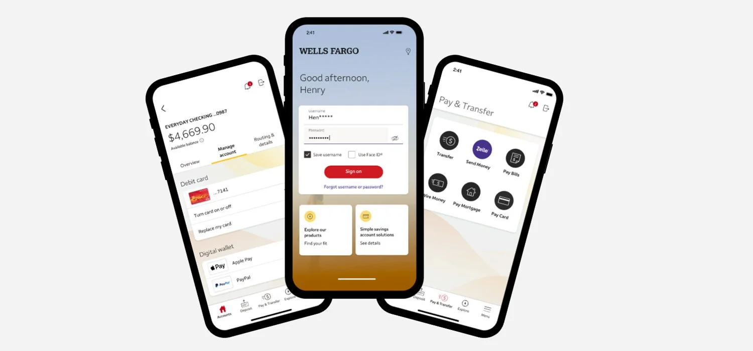
Upgrade to the reimagined Wells Fargo Mobile® app today and say hello to easier. Our rebuilt app offers enhanced performance and streamlined navigation, making it easier to find what you’re looking for and breeze through your everyday banking.
New look and feel
Enjoy a reimagined look and feel, easy-to-use navigation that puts your favorite features at your fingertips, and tailored support for your unique banking needs.
New Account Details
One glance gives you the big picture. Experience streamlined account views and clickable transaction details to help stay on top of payments and purchases.
New Pay & Transfer center
A quick and easy place for any way you choose to move your money. Send and receive money with Zelle®, Footnote2 pay bills, make transfers, Footnote3 and more.
Zelle® is now a part of the Pay & Transfer center.
USER PERSONAS
COMPETITIVE RESEARCH
I had fun compiling data from four competitors in the plant care category. We compared their values, features, cost, and price point. What was deterring some consumers from one product or another? Which products were well-received in the market and which were less so and why? We wanted to identify all these points before making a decision on features, functionality and positioning of our product.
Design System
USABILITY TESTING & FEATURE ITERATION


Wells FaRGO Overview
July 2020 - January 2021
I started my contribution with Wells Fargo from supporting the mobile app navigation redesign that included top/bottom bar and menu components.
Onboarding case study that detailed my 2+ week process of multiple attempts to open a Wells Fargo checking account.
Visual Design - over 200+ latest versions of screens for banker documentation. ( Working with Stephen Zito as design lead, Erik for content, and Sarah as project manager)
Visual Design - Appstore mobile app update screens for ios, android mobile and tablet, + for marketing purposes to produce promo videos.
Visual/Interaction Design - explored various animated and visual approaches Coach mark - Tool tip component to introduce bottom nav bar functionality.
February 2021 - May 2021
Research - Competitive research and benchmarking for native mobile app design with detailed analysis of: N26; Mint, BBVA
Visual/Interaction - Executed the concepted top bar across various app flows - refine and customize the approach across various modules.
Visual/Interaction/Research - navigation patterns vs branding elements in mobile apps for premier luxury customer segment.
Visual/Interaction - Developed native mobile app component delivery format for navigation components.
Research Sessions - Collaborated with lead researcher, transcribed interviews and finding patterns, conclusions, created the final research readout
Collaborated with BCG on the initial concepts for Accounts, Account Details, All Transactions and Transaction details
June 2021 - March 2022
Visual/Interaction/Research/Design systems/Architecture/Testing/Deployment - created scrum/design system visual/interaction/prototype/usage example deliverables for the following IOS & Android native components: Account tiles, My Wells Fargo deals, Bottom sheets, Native dialog, Account detail header, Account details tabs: overview, manage account, routing & details; Transaction details, All transactions, Transaction search & filter, Fico tiles, Complex account tiles, Account tile customization.
COMPLEX VIEW RESEARCH READOUT
Account View Settings:
Participants didn’t grasp the relationship between the toggle
Ungrouped single account was not understood as different from account group card
Account View Settings:
Combining check and savings into cash category is problematic
Recommendations:
Invest into robust account customization scheme.; that will enable the user to adjust groupings, visibility and account display order.
When collapsed account has a message - Add an indicator the presence of an enclosed account-level message on the group card.
Simplify complex view controls, remove the group toggle.
Provide better visual distinction between group and individual account cards.
Lessons Learned
Testing:
Most of the testing was performed using Browserstack simulator, or on own IOS devices.
Various component sections and interactions were tested months apart, independently from each other in different environments.
Development:
Framework continuity was affected since both IOS and Android lead developers departed at the half point mark.
Challenges building native framework dev teams
Design system:
Components were already being build, while the design system continued to evolve.
Framework components had to be actively revised and maintained
Design team was transitioning from Sketch to Figma created additional workload building and transitioning the design system.
Navigation architecture:
Native navigation strategy was discarded and a partial best use case scenario framework adopted.
Deprioritized architecture framework and focused on visual impact
Running into displaying and navigation issues with webview, no-authenticated experiences along with native mobile.