

AVS NEXT
Product Design I UX Design I Illustration I Photography I Site Map I Wireframing I Competitive Research I User Testing
Applied Video Solutions (AVS) is a professional services and systems integration firm specializing in Digital Video Surveillance and Security Management Systems for a range of companies, including Chevron, St. Regis, Jelly Belly, New York Times, and Goodwill, and public agencies, such as SFMTA, BART, and others. AVS has deployed next-generation integrated security surveillance systems with hundreds of networked cameras across several high-traffic business districts in San Francisco: Union Square, Japantown, Russian Hill, Central Market and others.
The current applyvideo.com website is outdated visually and functionally and does not reflect the brand guidelines that were developed for AVS in early 2017. AVS executive stakeholders wanted a modern, sleek, visually striking, high tech website that showcases next-generation security philosophy, elevates the company’s profile, and serves as a great sales support vehicle, integrating sales funnels with content and email marketing. We chose to go with a process that is a combination of waterfall and agyle development, focusing on research, structure and content first, and constantly revising our visual approach.
CHALLENGES

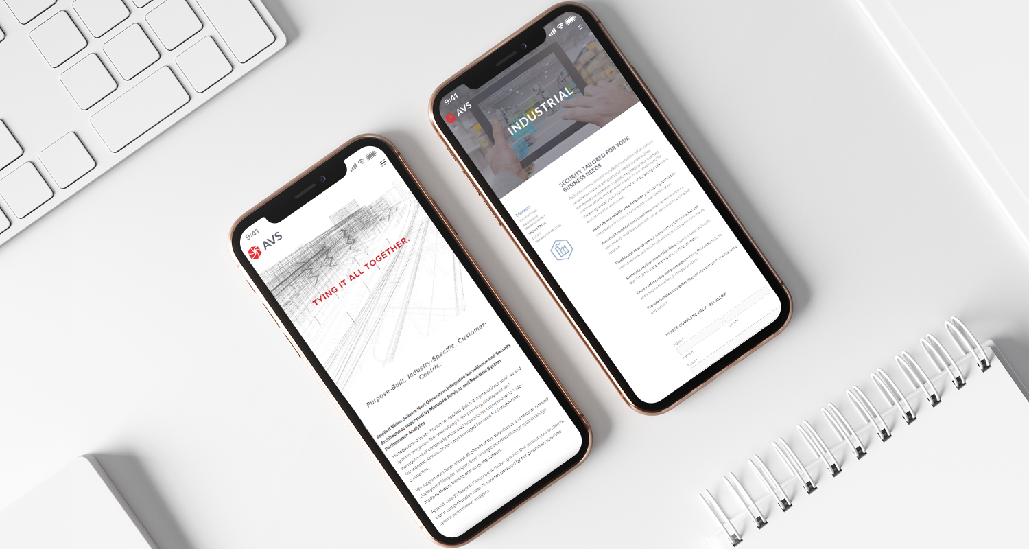
Our main challenge was to arrive at an optimal information architecture that balances the breadth of AVS’s expertise with functionality and usability. Because AVS provides security solutions across multiple verticals like Government and Law Enforcement Agencies, Real Estate, Industrial, Food Service, Hospitality, Transportation, Technology and Enterprise, it was essential to cover most of the verticals without overloading the user with too many choices. It was important to deliver the new website in a timely manner on a limited budget, hence the scope had to be optimized. In consultation with the executive stakeholders, ui/ux experts and select AVS customers, we arrived at five main categories: Property Management, Industrial, Enterprise, Transportation and SafeCity. After several iterations of site maps, wireframes and mockups, we decided to remove the technology section of the website and focus on services, solutions and the specific markets AVS serves. We also chose to highlight the Next-Generation Security advantage by featuring its benefits on the home and best practices pages, while integrating the Next-Generation Security theme across the whole AVSnext website.

Our next challenge was to organize the content and create copy, headlines and benefits for each page. We employed several rounds of competitive research, integrated partner content, and revised and integrated AVS’ sales. While 80% of the copy was finished by the second week of the project, we continued to revise the content for clarity, consistency and flow. We chose to launch the website with the copy in its current state and plan to hire a copywriter to finalize it at a later stage, after the feedback from the beta launch is gathered and analyzed.

Our next challenge was to select appropriate stock imagery that adhered to AVS brand guidelines; we wanted images that were natural, innovative, positive and showed benefits of humans interacting with technology. After three rounds of image selection, the imagery was approved and selected. We continued to improve and fine-tune imagery for some of the more difficult categories. We chose to delay the integration of video content for the homepage until a later stage of development.

We tackled the web development challenge by fielding bids from local and overseas developers, which came in ranging from $2.5k up to $60k. In the end, due to the company’s limited budget and the need for control and flexibility, we choose to develop it ourselves after finding a mobile-optimized Squarespace theme that met most of our requirements. When we were halfway through the entire project, we put all of the existing content into the template, which served as a functional prototype. We continued to edit the copy, visual elements and informational hierarchy throughout the development phase.


Once 90% of the copy, site structure and visual content was finished, we worked with an overseas illustrator to refine infographics, thumbnails and iconography. After two rounds of revisions, the site was ready for its beta launch and first round of user research and testing.