
SYMPATHIZER MENTAL HEALTH NAVIGATOR, IOS APP
Product Design I UX Design I Illustration I User Research & Testing I User Flows I Prototyping
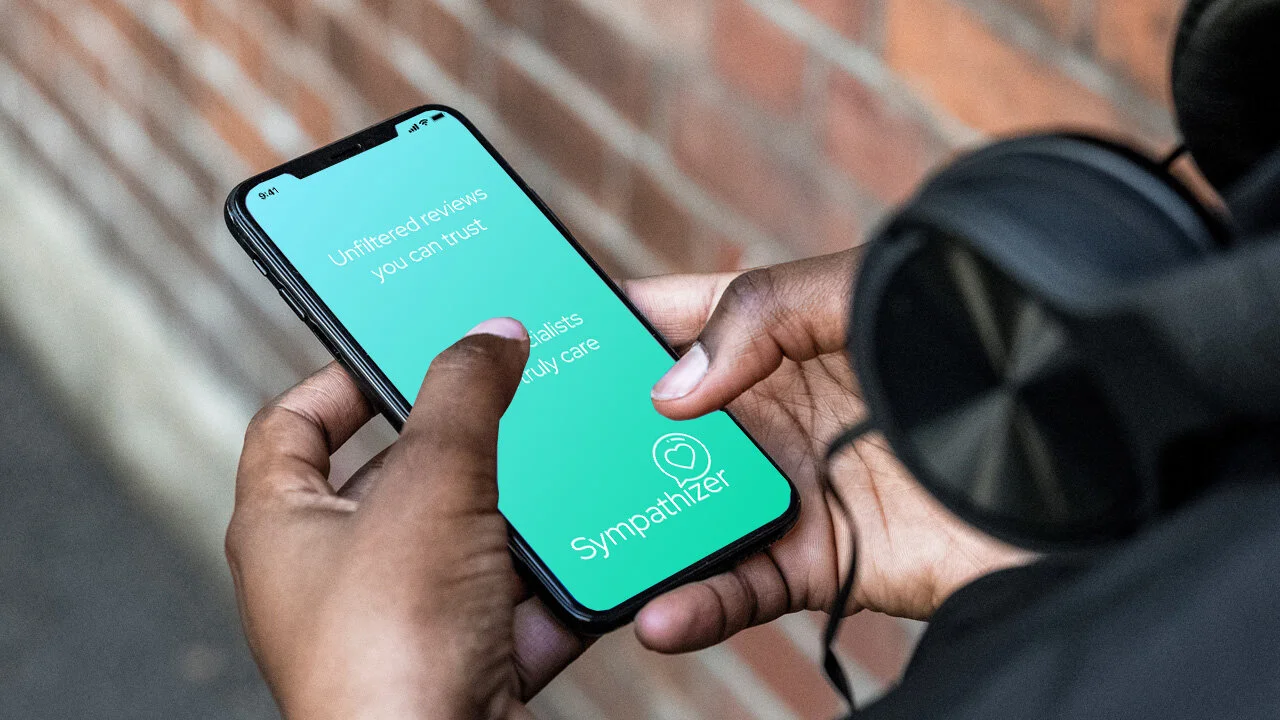
OVERVIEW
Finding mental health services can be extremely difficult and frustrating. We designed an application that makes it easy to find the mental health services that work for you.
Team Size & Responsibility
Janet Calderaro - Research, Wireframing, Low-Fi Prototyping.
Patricia Huang - Research, Wireframing, Low/Hi-Fi Prototyping.
Stefan Patashvili - Research, Wireframing, Low/Hi-Fi Prototyping, User Testing, Brand Guidelines.
Timeline & Scope
5 weeks timeline. We reduced the initial scope from an all-you-could-possibly-want mental health services app with a mental health evaluator and teleconferencing features to focus on navigating the mental health services system. We added coping mechanisms in addition to booking an appointment with a mental health professional.
PROBLEM STATEMENT
The purpose of this project is to democratize access, simplify navigation and increase positive outcomes with the mental health system for everyone, especially those without insurance coverage.

USER REsearch & Outcomes
Interviews & Survey
We conducted 9 user interviews to transform our proto-personas into user personas and found that 6 out of 9 interviewees had anxiety or depression and found seeking mental health challenging. Survey via Google Forms: 26 Responses: 47.5% respondents are dissatisfied with mental health services, 60% find it difficult to find mental health resources, 50% use the internet to find mental health specialists.
Target Users
Elizabeth Huang: 25 year old Introverted and Artsy, Administrative Assistant, Struggling with Anxiety and Depression, Blue Cross.
William Hogues: 32 year old Extroverted Uber driver, Veteran struggling with PTSD and Anxiety, Uninsured.

USABILITY TESTING
We performed 9 paper lo-fi and 6 hi-fi prototypes to gather feedback from instructors, classmates, and other ux designers to improve the functionality and the flow of Sympathizer. Any issue that got more than two users bothered was rated as high user priority. After organizing the issues by priority, the most glaring navigation and iconography issues were addressed. The second set of usability tests helped us identify and resolve usability issues.

STyle Guide & Final Prototype
During the entire project, we generated four different logos and fine-tuned the colors and fonts. Sympathizer is a friendly and helpful guide who is easy-going and empathetic.
We spent the most time figuring out the best filtering solution. After that was solved, we optimized location permission and results mapping, as well as added self-care functionality for the final hi-fidelity prototype.

COMPONENTS

KEY TAKEWAYS
Designing and prototyping with Figma was fast and intuitive!
User and expert interviews were very insightful.
Meeting in the middle with respect to our individual styles and vision.
Difficulty selecting and sticking to core set of features.
I learned from Patricia’s artistic point of view.

PRODUCT ROADMAP
Add non-insured user persona and flow.
Design and add teledoc functionality.
Update the style guides and colors in an orange/purple direction.
Fix the on-boarding usability issues.
Add tabbed sections to individual specialist screen.
Add to your calendar appointment functionality.
Revise appointment booking flow.
Increase target size
Add navigation by voice feature